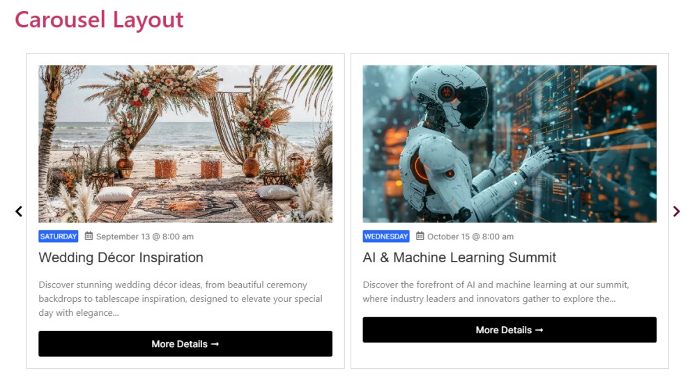
The Events Carousel layout allows you to display events in a sliding carousel format, making it visually engaging.
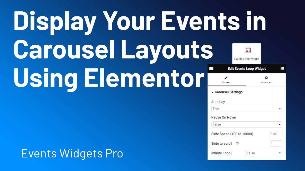
Follow the steps below to display your events in carousel layout:
Add Events Loop Widget
- Go to Pages/Posts > Add New.
- Click the Edit with Elementor button.
- From the widgets section, drag and drop the Events Loop Widget.
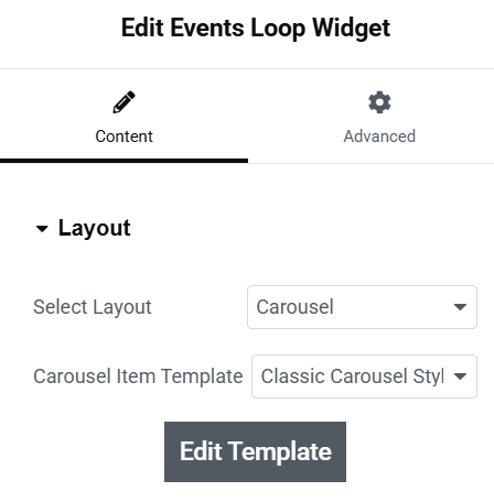
Customize Layout
After selecting the carousel layout, you can customize it using the following settings:
Carousel Settings
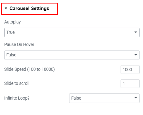
- Autoplay: Turn this on if you want the slides to move automatically without clicking.
- Pause On Hover: Enabling it will pause the autoplay when you place your mouse over it and start again when you move the mouse away.
- Slide Speed (100 to 10000): Control how fast the slides move during the transition.
- Slide to Scroll: Specifies how many slides move at once when the carousel transitions (e.g., 1 means one slide per scroll).
- Infinite Loop: Turn this on to make the slider move in a loop, after the last slide, it will go back to the first slide automatically.
Navigation Settings
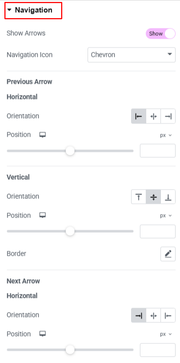
- Show Arrows: Turn this ON or OFF to show or hide navigation arrows in your carousel.
- Navigation Icon: Choose the arrow design or icon style according to your preference.
- Horizontal Orientation (Previous arrow) : Choose how the arrow will be placed horizontally (left or right side).
- Position : You can also set the position of the icon horizontally using this option.
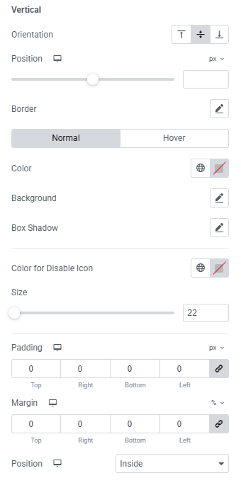
- Vertical Orientation: Choose if the arrow should move up or down vertically.
- Position : You can also set the position of the icon vertically using this option.
- Border :
- Border Type option provides different types of border for navigation buttons.
- Border Radius is used for set radius of border.
- Next Arrow: Control the Next Arrow position vertically or horizontally and adjust its border style as we have done for the previous one.
- Color: This option is used for the navigation icon color.
- Background: This option sets the background color of the navigation icon.
- Box Shadow: Add a shadow around the navigation icon.
- Color For Disable Icon: Set a color for arrows that are disabled.
- Size: Adjust how big or small the arrow icon should be.
- Padding: Add space between the border and the icon.
- Margin: Add space between the button and other elements.
- Position: Choose if the arrow should appear Inside or Outside the carousel area.
Pagination Settings
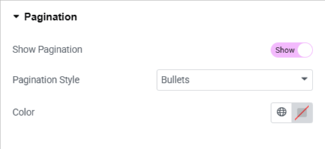
- Show Pagination: Enable this option to add pagination to slider.
- Pagination Style : Choose a style from bullet style pagination, fraction style, and progress bar style pagination.
- Color: Choose the color for pagination.
Output
