The Events Shortcodes plugin allows you to display events anywhere using shortcodes. But if you prefer a dedicated block with drag-and-drop customization, you can use the Events Loop Block inside the Gutenberg editor. This makes it much easier to add, preview, and customize event layouts.
Add Events Loop Block in Gutenberg
Follow the steps below to add the events block:
- From your WordPress dashboard, navigate to Pages or Posts section.
- Open the page where you want to display your events.
- Click the + icon to add a new block.
- Search for Events Loop, and add it to your page.

Choose a Layout and Style
After adding the block, a popup will appear where you can choose how your events should appear.
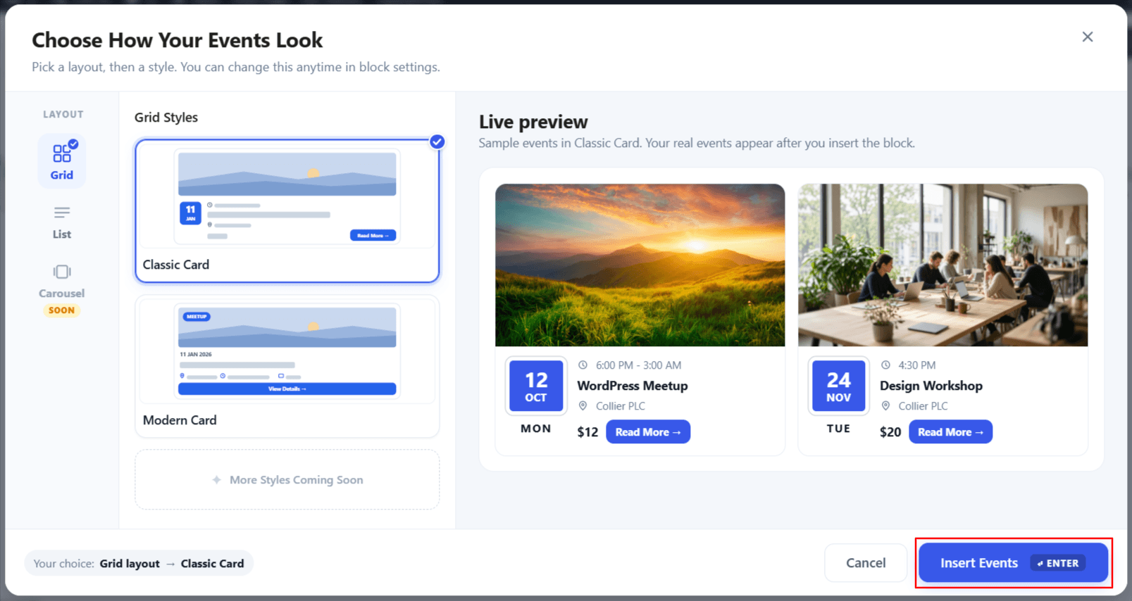
- Select a layout, such as Grid or List.
- Choose one of the available event Grid or List styles.
- Use the live preview on the right side to see how the selected layout and style will look.
- Once you are satisfied with your selection, click Insert Events. The Events Loop block will be added to your page.
Configure the Events Loop Block
The block includes two main tabs: Layout and Filters.
Layout Settings
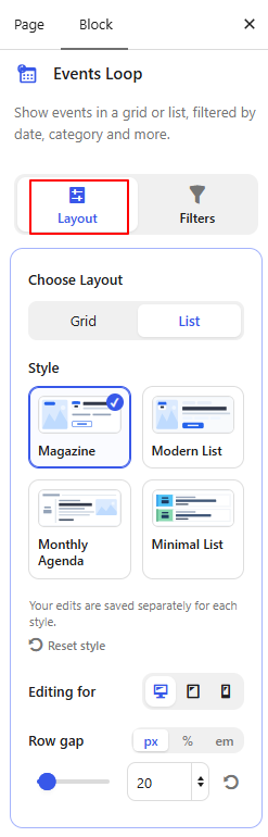
- Choose Layout: Select how the events will be displayed. You can choose between Grid and List layouts.
- Style: Choose the card design for the selected layout.
- Editing for: Choose the device view you want to customize. You can switch between Desktop, Tablet, and Mobile settings.
- Row Gap: Adjust the vertical spacing between rows of event cards in the selected layout. (If List Layout is selected)
- Columns: Set how many event cards should appear in each row for the selected device. (If Grid Layout is selected)
Filter Settings
From the Filters tab control which events appear in the Events Loop.
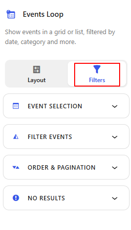
Event Selection
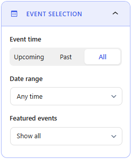
- Event Time: Choose which events to display based on time: Upcoming, Past, or All events.
- Date Range: Limit the event listing to a specific date period. Select Any Time or custom according to your preferences.
- Featured Events: Control whether to show All, featured events or hide featured events.
Filter Events
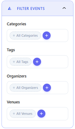
- Categories: Choose one or more event categories to display only events from those categories.
- Tags: Filter the event listing by selected event tags.
- Organizers: Show events linked to specific organizers.
- Venues: Display events taking place at selected venues.
Order & Pagination
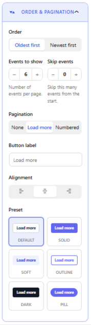
- Order: Choose whether events should appear with the Oldest first or Newest first.
- Events to Show: Set the number of events displayed per page.
- Skip Events: Skip a specific number of events from the beginning of the results.
- Pagination: Choose how visitors move through more events. Available options include None, Load More, and Numbered pagination.
- Button Label: Customize the text shown on the Load More button.
- Alignment: Set the pagination or Load More button alignment to Left, Center, or Right.
- Preset: Choose a ready-made button style such as Default, Solid, Soft, Outline, Dark, or Pill.
No Results
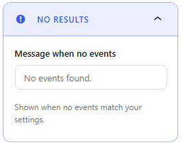
- Message When No Events: Enter the message shown when no events match the selected filters or settings, for example, “No events found.”
Style Settings
The Style tab appears when Load More pagination is enabled. It lets you customize the appearance of the Load More button using the following options:
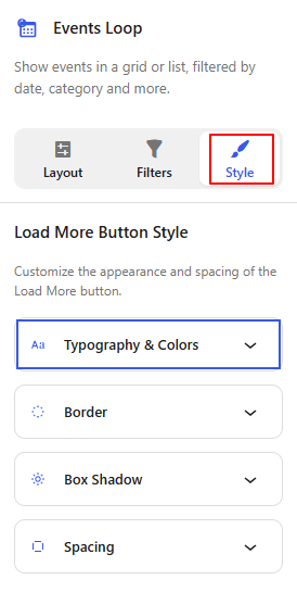
- Typography & Colors: Customize the button text style, text color, and background colors.
- Border: Adjust the button border style, width, color, and radius.
- Box Shadow: Add and customize a shadow around the Load More button.
- Spacing: Control the padding and spacing around the button.
Customize Individual Event Loop Block Elements
Each event card contains different elements that can be customized separately.
- Select the element that you want to customize inside the Events Loop block.
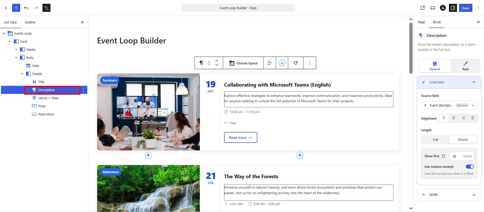
- Use the General and Style tabs to configure the selected element.
General Settings
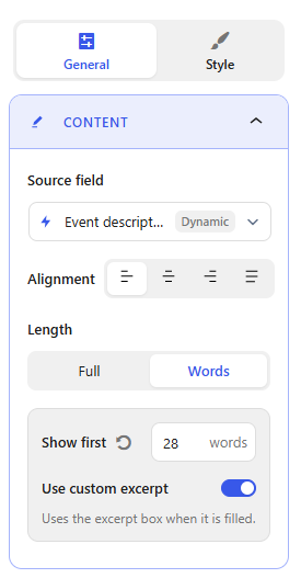
- Source Field: Choose which event information should appear in the selected element.
- Alignment: Set the alignment of the selected content using the available alignment options.
- Length: Choose whether to display the Full content or limit it by Words.
- Show First: When Words is selected, set the number of words you want to display.
- Use Custom Excerpt: Enable this option to use the custom excerpt entered for the event, when available, instead of automatically showing text from the full description.
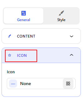
- Icon Settings: You can choose an available icon or keep it set to None if you do not want to display an icon.
Style Settings
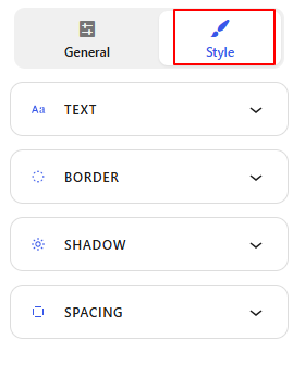
- Text: Customize the text appearance of the selected element, including typography and text color.
- Border: Adjust the border around the selected element using the available border controls.
- Shadow: Add or customize a shadow effect for the selected element.
- Spacing: Control the spacing around the element using padding and margin settings.
Repeat the same process for other supported elements inside the event card to control the information and appearance of each part of the layout.
Add New Event Element
If you want to display additional event information, you can add new elements to the event card by following below steps:
- Click the + icon inside the Events Loop card.
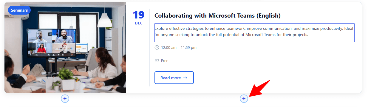
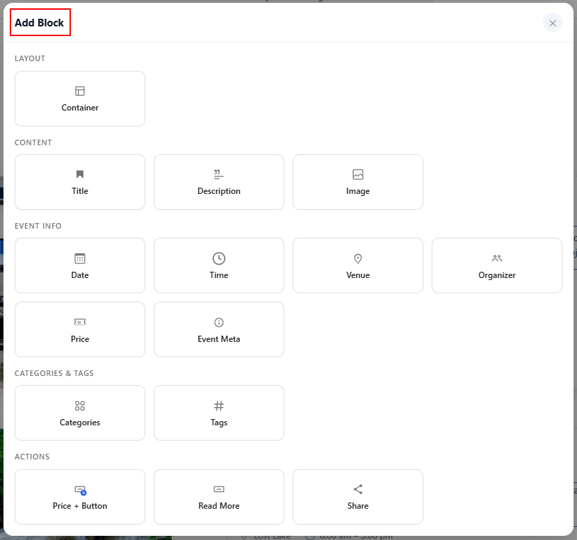
- Choose from the available event elements and add the information you need to your card.
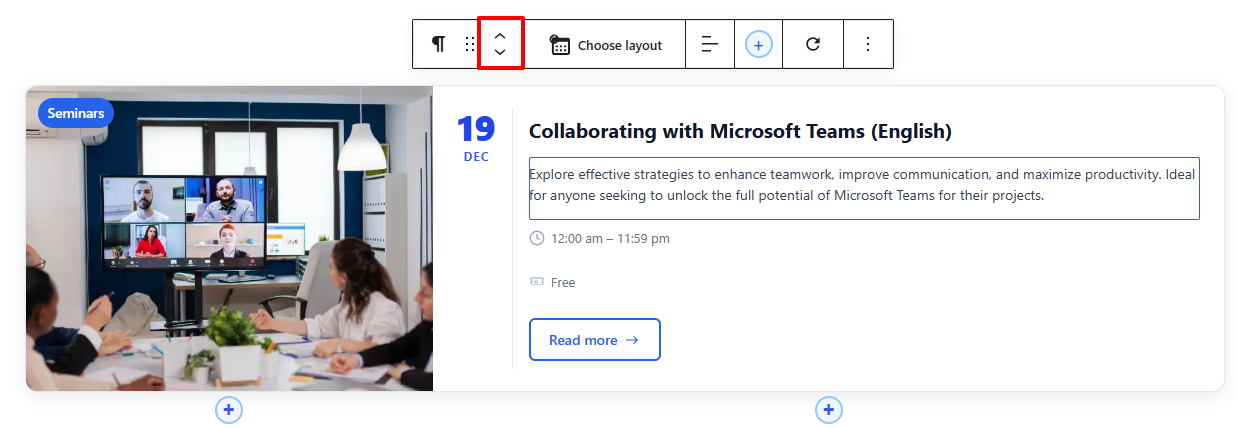
- Additionally to change the order of a new element, use the up and down arrow buttons to move the block as needed.
- Once you have finished customizing the Events Loop Block, save the page and preview it.